This something I experienced once at an anime convention. (Although, it was not this exact photo.) These chalk artists put “chalk art” to a whole knew level. There works are 3D and are absolutely believable. This coke bottle looks like you can literally “try” and pick it up and get yourself a drink. It doesn’t even look like chalk! The highlighting within this piece really makes the bottle pop!
Sarah Nitschke's Student Blog Collaborative for Cardinal Stritch University
Monday, September 30, 2013
Friday, September 27, 2013
Yarn Away
For 3-D concepts we had to use yarn in different areas of the school that presented the work of Fred Sandback, who used the concept of lines in his pieces.
My partner and I were given a stairwell in the CFA building. Students from a different class had painted the images on the wall a few months ago. So we decided to enhance this space by framing it with the yarn, which was pink and blue. It took about an hour and a half to complete, but it turn out well.
My partner and I were given a stairwell in the CFA building. Students from a different class had painted the images on the wall a few months ago. So we decided to enhance this space by framing it with the yarn, which was pink and blue. It took about an hour and a half to complete, but it turn out well.
These photos are the preliminary ideas. I'll post pics of the finish installation soon.
Madness at Utrecth Demo
I got to see James Hemple, a well-known painter in Milwaukee do a
portrait at my job. He took his time and was very careful with his
strokes. I watched ever chance I could in between customers and other
assigned tasks. It took him about 2 hours to complete. The lady stood
still the whole time. I know that's not to hard to do, but I know it
could have not been me. I move way too much.
Anyway, it was cool to have him there. Most of the customers/guests sat through the whole demo.
He also gives painting lessons, so maybe one day I'll check it out. Great time at Madness!
Anyway, it was cool to have him there. Most of the customers/guests sat through the whole demo.
He also gives painting lessons, so maybe one day I'll check it out. Great time at Madness!
Thursday, September 26, 2013
2 Face
This 2 faced wonder was created by artist Sebastian Bieniek. He combines both art and photography within this piece. I like how he combines his artwork with the woman to give us the illusion that she has an actual eye. What do you think?
Chrome Experiments
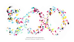
Chrome is currently celebrating '500 Chrome Experiments'. Someone sent me a link to one of the experiments and I was curious, so I looked past the flash and fun of the activity I was sent and discovered even more. Chrome Experiments is a site where web designers who are part of a creative coding community can share their web experiments. They currently are celebrating their record of having 500 loaded on their site. Each of these experiments are created using either HTML5 or Javascript and incorporate the use of Canvas, WebGL and/or WebRTC.
I started playing around with some of these experiments and exploring them and I give props to the people who can create these games that entertain so many people on-line. I have dabbled only a little in the world of web design and I haven't even scratched the surface. The purpose of the common area to share these creations is to provide inspiration to creative minds and to show just how powerful, fun and free the internet can be. Anyone can submit an experiment as long as it meets the requirements of the site: http://www.chromeexperiments.com/submit/
Monday, September 23, 2013
Progress for Typography
For my ART 239 Typography class we had to do a series with each piece building upon each other. I will present the 4 out of 6 drawings/paintings we had to do.
I felt like even though I did not have a piece that looked finalized, I still felt like if I progressed further with my series it would have a combination between all the pieces I will present. I progressed further than I expected and I think the reason for that was because I listened to the suggestions from my peers and my instructor. Without their criticism I wouldn't have gotten as far as I would have thought.


I felt like even though I did not have a piece that looked finalized, I still felt like if I progressed further with my series it would have a combination between all the pieces I will present. I progressed further than I expected and I think the reason for that was because I listened to the suggestions from my peers and my instructor. Without their criticism I wouldn't have gotten as far as I would have thought.
TYPOGRAPHY ART
Here are images of (3) of the (6) paintings/chalk drawings that I had to do for ART 239 Typography
These works are meant to be a series of (3) with each one building upon the one before it...
These all received positive feedback, making the fact that they all turned out how I designed them a little pleasing at least...
Studying Typography
I thought I had already posted this blog, but I guess not, so here it is:
A week ago....
While studying for my typography exam, I finally realized there is so much to typography. I'm kinda worry that I won't remember everything or I'll start to mix information up. I do understand most of it, but there were some information I actually drew my interest in wanting to learn more and more about where fonts come from and the anatomy of letters. As a aspiring graphic designer, the work I do now shows my close attention to typefaces and lettering, but I think the more I learn, then better my work will become. I want to build a connection between my artwork or print materials and the fonts/typefaces I used.
Event notice: Madness Party
Also get 30% off of non-sale items.
Any Wall/Mural Artists Out There?
I think it will be fun and interesting to see how it turns out!
*This sides walls have mirrors and silhouettes of the dancers.
Good Site-Bad Site
1) I had to find a well-designed website and describe what I liked about it.
2) I had to find (2) poorly-designed websites and break them down.
Here is the good one:
And here are the bad ones:
Websites-- Effective or Ineffective?
For a recent assignment I was asked to research websites and decide if I think they are effective or ineffective.
There are two websites that I have found that I believe have great websites.
The first one is of a local Milwaukee photographer named Elly Olson. Her site is light and simple with san serif text and pastel colors. It has a calm and fresh feel and a modern aesthetic.
http://www.ellyolson.com/#/photography/everyday?i=378
The second website I found that is well done is that of Daniel Kennedy. When you first arrive at the site you see a welcome screen which is simple in color and composition. Then, when you enter the site, you're immediately hit with this photographs, with a navigation bar at the top. I found this to be very eye catching as you could immediately see his striking photos and effective because you didn't have to search through his site to to see his images.
http://www.danielkennedy.com
A website that I found to be boring and too busy, font-wise, was the local Cedarburg Comets website.
It has very limited color for a girls volleyball club website and doesn't use typeface or font color to create balance or cohesion. The site contains body paragraphs with multiple fonts that makes it too busy and has a large width which makes the text somewhat overwhelming.
http://www.eteamz.com/CedarburgComets/
Thursday, September 19, 2013
Hellooo iOS 7
I just downloaded the newest firmware (iOS 7) on my iPhone, and I must say its quit the difference. There are quite few new features and other tweaks. The design of the new firmware, however, seems to be the biggest change on the iPhone and iPads. Apple made a bold move by completely changing their look. Everyone has been so accustomed to the classic look of chrome finished buttons. But now, iPhone has a sleek, crisp interface, which I find as a breathe of fresh air. It's clear to see Apple is trying to stay on the avant garde of mob like design.
Wednesday, September 18, 2013
Group Website for Digital Applications 1
Melissa and I got together and made a quick gallery website, choosing the topic of Typography. She contributed to a bit of html work with the images (except homepage) and I did the rest. Choosing the background was a group decision.. We felt it looked best with the white background. I noticed that I spelt Gallery wrong, but the project was to show that we knew our stuff with the html codes as not much the real technical difficult stuff. This is just a taste of the website, as you can see, there was one homepage and 3 subpages.
Girl with Tear
This artwork, ” Girl with Tear” was created by Roy Lichtenstein. I remember going to the art museum and seen another version of this type of work by him and I found it really intriguing when I first saw it. I loved it because it reminded me of an old comic book with its colors, style, and his use of lines and dots. This one differs from the one I seen by such that this one is a picture of an eye and the one I had seen before was the picture that had a portrait of a woman crying. When comparing the two I do like the woman one better with her full face opposed to this one but I do think that this one was made more abstract. What do you think about this piece ?
The Duplex NY
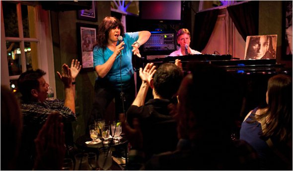
This past weekend I was in New York and went to my boyfriend's sister's piano bar called The Duplex. She is an amazing singer and works there singing and bar tending. I had never been to a piano bar before, let alone in NY, but have heard fun stories about it. It was a great experience. The singers were great and sang songs from ones of Mariah Carey to ones of broadway musicals.
As The Duplex is in a more "friendly" part of New York, I was able to attend a drag queen show happening in the upstairs part of the building. This was also a very unique experience for me as I have never been to one before. It had great dance numbers, comedy, and costumes. I really enjoyed the show and the overall experience at the Duplex. Everyone was extremely talented and some of the nicest people I have ever met.
If you're open to trying new and interesting things, I would recommend trying out a piano bar and/or drag show, if you have the opportunity. It is a whole other culture and form of theatre that most people don't get to experience.
If you're open to trying new and interesting things, I would recommend trying out a piano bar and/or drag show, if you have the opportunity. It is a whole other culture and form of theatre that most people don't get to experience.
Tuesday, September 17, 2013
The Barbara Bates Foundation
 Breast cancer awareness has been a big part of my life because of my mothers passing of stage 4 breast cancer when I was 10 years old so seeing anything about breast cancer awareness always gets my attention. While looking at future shows in Milwaukee I found one about a fashion show in recognition of Breast cancer Awareness Month in October. Breast cancer survivors will model a collection of fashions designed by Barbara Bates. The money raised goes to the Flippin to a Cure and the Barabra Bates Foundation Institutional Grant on Disparity and Education of Breast Cancer. This grants serves to educate and address the gaps of breast cancer care faced by many women in the African American and Latino communities. The proceeds from this even will go to the breast cancer outreach and education programs of Froedtert Health Care Center. The Fashion Show is at the Milwaukee Art Museum on Sunday, Oct 20 7:30PM. I will most likely be going if my schedule permits it. I feel like it would be an amazing event to experience and I hope to make a blog about it after I see the show!
The Veterans Book Project
I like to go to the Milwaukee Art Museum in my free time with friends and family and what I've noticed over the months is one exhibition in particular. It's called The Veterans Book Project and since 9/11 passed a few days ago it reminded me of the pieces I saw/read at the Museum. The Veterans Book Project is a collaboration of books authored by artist Monica Haller and veterans who have been affected by Americas involvement in the wars in Iraq and Afghanistan. The experiences that these soldiers experienced are problematic when returning from the war. They are faced with obstacles when it comes to getting back into civilian life. Living with the loss of friends, limbs, and dealing with depression is hard. Knowing that most of the people at home don't understand what it's like is hard to deal with and Haller believes that photography and art can play a role in the recovery process. In December 2012, the Veterans Book Project came to the Milwaukee Art Museum for a two-week workshop. Local veterans, family members, and others that have been affected by the wars shared their experiences by editing and designing their archives and stories. There are a total of 53 books that make up the Veterans Book Project Library, with five of them coming from local veterans. It really is a very emotional exhibit because it's something that is told by real people that have gone through the horror of war and this is one way of telling their stories. The exhibition runs from April 4- November 10, 2013. All Veterans receive free Museum admission during the run of the exhibition.


Saturday, September 14, 2013
Monday Night Portrait Sessions at Utrecht Art Supply Store
I just want to let everyone know that Utrecht Art Supply store on Farwell has (this) Monday Night Portrait Sessions from 6:30pm to 9:30pm! The cost is $8
per session or eight sessions for $40.
So if anyone likes to draw or may be interested in trying something new, check this out.
Facebook Page Utrecht Art Supple Store
So if anyone likes to draw or may be interested in trying something new, check this out.
Facebook Page Utrecht Art Supple Store
Box Project
In my 3-D concepts class, we had to make a box for our first project and for our second project we're suppose to re-interpret the box into something else. So I decided to make my box into something relatable.
It has 6 sides, all with "cracked" designs and each with a different word associated with feeling broken or fragile: Insecure, sorrow, anxious, lonely, discouraged, and disconnected. Many people can relate to seeming strong and put together, but there are times when they are struggling and seem to be falling apart. Sometimes people hold their feelings in and it's not until they can't take it anymore that they break down.
The box is a symbol of this situation. The box was once clean, smooth surfaces, and durable until things start picking at it. The cracks represents the weakness or vulnerability a person can feeling or going through when those negative feelings start coming at them.
When I'm done with the designing, I'm going to put bubble wrap around it. The wrap will represent the carefulness one needs to have when dealing with these feelings that make someone feel fragile or broken.
I'll post the pics soon of this project for a better visual understanding of what I'm talking about!
Thursday, September 12, 2013
Eggo
An Italian artist, Marcello Barenghi created this work of art. He did a series of photos that consisted of drawings made to look 3D! The materials that were used were drawing paper and colored pencils. It is hard enough to a 2D drawing but a 3D drawing with actual dimension is mind blowing. He makes art come to life, what do you think ?
Wednesday, September 11, 2013
IMAGE GALLERY IN HTML
Here are a few screen captures of the HTML Image Gallery we had to create in


ART 202 A - Digital Applications I
HOME (INDEX)

PAGE 1: RED

PAGE 2: YELLOW

PAGE 3: BLUE

Tuesday, September 10, 2013
A Blast From The Past: MAPPY
I do not know how long I have been searching for this online...
Okay, maybe it's cause my searches were not all that diligent, but this 2D game has always been one of my all-time favorites.
I can remember when all of my older brothers were always playing Pac-Man or Champ Galagon, I was perfectly content with having the high score on this addicting little game.
The gameplay is straightforward in that you take control of a police officer mouse and try to collect valuable items before the CPU-controlled cat characters can steal them.
Bouncing on the colorful "trampolines" will allow you to get to higher levels, but be careful: too many bounces on the same line will break the trampoline, sending the title character out of the screen...
This Namco classic is, as they say, easy to play but hard to master...see for yourself...
The Fault In Our Stars
I remember having to read this book for one of my first college classes, thinking at first that the story was not all that realistic, but then, as I got more into it, I remember enjoying the carefully developed characters and the sad but inspiring story.
I think that this is a great read, not only because the cast is memorable and really easy to visualize, but also because the book's message is clear and the author really knows how to make everybody interact well with one another.
He also puts a few satisfying bummer/annoying twists in the story to throw off the reader
(even if you can understand what will happen to the characters as the story draws to a close)
I am often the kind of person that will only read if I have to, but this book captivated me and kept me turning its pages even to the tragic but fulfilling ending.
Much to my surprise, a film adaptation is officially in the works!
Below are photos of the current cast choices for the main characters...
Feel free to comment in either approval or disapproval below.
Shailene Woodley as Hazel-Grace Lancaster
Ansel Elgort as Augustus Waters
Nat Wolff as Isaac
Willem DaFoe as Peter Van Houten
Next Project: Exploring Lettering Part: 2
My first drawing took me longer that I thought it would, but sometimes I like taking my time so my work isn't messy. I didn't know at first how creative I was going to get, but I just let my artistic juices take over and went with the flow. Eventually I got done and I don't it turned out too bad for my first time drawing the letter at such a large size.
Today I didn't have much time to dedicate to my second drawing, so instead of trying to measure everything out perfectly, I did a quick sketch first. Then I went back over with my pastels. It did take me less time than the previous drawing, despite how I drew the letter twice.
I noticed between my first and second drawing there are differences. I curved the single "y" more in the first drawing and the two "y"s are more straight. I will have to really be more careful on the next two I do, which instead of pastels I'll use the sharpies. There needs to be consistent in all the pieces I'll produce over the next couple weeks.
Tomorrow I think we will go over what we've produced so far...
Monday, September 9, 2013
I Said Yes!
I am getting married!...as the title of this post obviously suggests. You may know me personally or not at all, but people blog about what they are discovering, learning about and interested in. Currently, I am quite interested in planning things. When my fiancee and I started telling family and friends our news, there were two common questions: 1) Did you set a date? and 2) Can I see the ring?
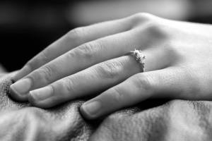
I really love my ring. My fiancee did an amazing job. Its simplicity of the three stones and the simple white-gold band is the perfect style for me. The stones have a quality to them that allows them to sparkle even in darkness.
I became curious as to reasons why the three stone setting has been so popular lately, other than its aesthetic and symmetrical qualities. There were three different 'theories' that I came across by word of mouth or looking up different things online. One idea is that the three stones symbolize the Holy Trinity: Father, Son and Holy Spirit. Another is that each stone represents the couple's past, present and future. The idea that I liked the most is that the two smaller stones on either side are to represent you and your fiancee and the larger stone in the middle is to represent God, and the fact that they are on on the same ring symbolizes that you will always keep God in your relationship. This last idea seemed to fit the best into the relationship that my fiancee and I have.
I am feeling loved and blessed and simply happy. Here is a link to where the ring was purchased: http://www.williamnordstromjewelers.com/
Barbie's Wedding Album
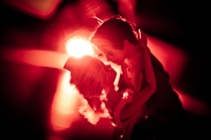
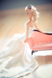
Beatrice told Rock n Roll Bride: “Barbie & Ken were married at Faraway Castle, in Plasticity. The bride bought her dress from The Fairy Godmother shop and her shoes from the Cinderella Store. The groom wore a suit from The Prince Charming Emporium. The couple met more than 50 years ago (yes I know they look young). Barbie was tired of waiting so she asked Ken to get married.”
I had found this post a while back and recently someone sent it to me again. A very talented and obviously quirky and creative artist, Beatrice de Guigne, had the honor of shooting Barbie and Ken's Wedding. Beatrice has her own company and is know as an 'award winning destination wedding photographer' (http://beatrice-dg.com/). Her work is exquisite and she really knows what she is doing.
Her work on Barbie's wedding was nothing short of humorous and entertaining. It also showed some of the really cliche shots that have become a staple in wedding photography: the shoes, the dress and the table settings. She did a great job of lighting each pose and getting things to stay in place, an as most of us girls know, making Barbie stand in her heels on her own is no easy task!
I read on her personal blog page (http://blog.beatrice-dg.com/barbie-ken-lexplication) that it took her three days at two hours a day to shoot the whole 'ceremony', and then an additional two hours to edit the photos afterwards. This time doesn't even begin to count for the months of collecting that she had to do in order to have all the right clothes and props for the shoot. It took time, thought and determination to get what she wanted out of the experience and it gives everyone else something new, different and fun to look at in terms of wedding photography.
The blog post that led me to this creative album can be found here:
http://www.glamour.com/weddings/blogs/save-the-date/2011/08/real-wedding-album-barbie-ken.html
http://www.glamour.com/weddings/blogs/save-the-date/2011/08/real-wedding-album-barbie-ken.html
Next Project: Exploring Lettering Part: 1
So we have a new project in class. I'm looking forward to trying
something new and challenging my artistic skills. I like to think
outside the box, so I'm hoping by the time I get to my final piece, it
is what I envision it to be. Even though I want to do two letters, I'll
go with one for now I can put in the time and effort to make sure it's
done well. I really like the Garamond typeface, so I'm thinking about
using that one for my letter choice, which is "Y".
I'll talk about my first two drawings in my next post.
For the next several weeks I have been assigned to explore the formal and aesthetic qualities of letters in various typefaces. I have narrowed my study down to a lowercase g in Baskerville Regular. In just the couple days I have been studying this letterform I have come to realize the unique and complex features of this letter. The different stroke weights and curvatures make for an interesting letter to create many artistically stimulating images. From this "g" I plan to make at least 6 large works/paintings that show off its interesting formal qualities that hopefully make its viewers see this "g" in a different way.
Perspectives
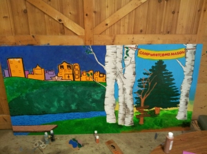
This past summer, instead of focusing solely on my photography, I got some ‘real-world’ experience. It isn’t what you might be thinking. I was shown the world from the eyes of an ‘inner city’ Milwaukee child between the ages of 7 and 17. I was working at a summer camp, teaching campers Arts and Crafts and learning from them as well.
I was to create and implement a variety of programs for the campers. Things that are interesting and will keep their attention and will ultimately teach them something. This I found to be a challenge as my background is not in education. But what better way to learn than to simply jump right in.
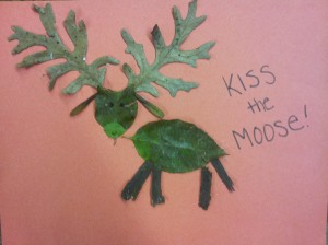
I planned making smaller crafts with the younger kids and working more on group projects with the older ones. We got creative together turning old milk cartons into Mancala boards and using found stones in nature as the beads to play with. We attempted to be a ‘modern-picasso’ when we cut out parts of magazines and glued them onto cardboard to create Picasso inspired abstract portraits. And during the last week, I was able to teach campers how to make grass headbands and weave in flowers. As well as creating a big, fun mess when I taught the youngest campers how to throw clay on the wheel.
These projects are something I have done already, so it seemed like no big deal to me as I was instructing them, but when I brought out the clay for the 7 year olds their eyes lit up and we created a tea party complete with clay pancakes and cookies. Or when I saw the older ladies wearing their grass/flower headbands for the rest of the day. I loved giving them something physical to take home from camp, for if they didn’t learn a valuable life lesson from me, they undoubted learned something life-changing from camp. I know I did.
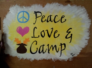
CWM for life.
Sunday, September 8, 2013
Random Note Part: 2
So I've complete my ransom note. My message is short (sometimes less is more), but I made it rhyme and also be a riddle somewhat.
"At the sail-less ship by the lake, bring me the LINK or you're dead WEIGHT!" What is the sail-less ship? Hmm....
At first I was having trouble finding what I needed to make it look right for the concept. Someone handed me a map San Fransisco surround by water, so that was very helpful. After that, I was able to go from there and get most of my lettering together. By the time I was nearly finish, I still didn't have the lettering for my two type term words: LINK and WEIGHT. Thanks to some advice from Sarah, I finally found what I needed and was to complete this project. Also after some feedback from classmates, I think it turned out well.
Image coming soon!!!
Applying Typography
I'm still learning what it is to be a good graphic designer. So even
though I think my work is good, there's always room for improvement. I
make flyers, posters, and other print materials and the fonts used makes
all the difference if it is well done or not.
Here's a flyer I just made. Usually it doesn't take me that long to make one, but lately I find myself really paying closer attention to where I put the lettering, the colors scheme, and other important elements. I needed the words to stand out and be eye-catching. It is promotion an up-coming dance competition, so the flyer had to grab people's attention and even evoke a sense of fun and expectation.
I think the more I learn in this class, my work will start to change and get better and better.
Cardinal Stritch Gallery Piece
This artist loves three things and made sure to have these 3 elements within her works for the art exhibit at Cardinal Stritch University. This artist loves the elements in which she included within her art piece: doodling, nature and fireworks. She includes these three elements together in 23 great pieces. The 23 pieces also include a button for backlighting.
The quality of the plant pictures in each frame is very nice. You can see the details in the petals and leaflets. Some of these pictures are abstract by having the picture of the plant very close up in zoom. She combines doodling and fireworks with her pieces very nicely. The doodles on each of the pieces are just designs of circles and swish marks, like that of a paintbrush. Another element is the fireworks.
My favorite piece is the one on the far right of a green plant. It shows beautifully of the three elements: nature, doodling, and fireworks. The fireworks on this piece are shown very well. I believe it is a ground firework, you can see how tall the firework, it’s color, and it’s detail. I had no idea fireworks had this much detail to them. They look even more brilliant than what I see when I watch them. I remember the artist said these pieces remind her of the fireworks that she watches here in Wisconsin. I do agree with her completely. I get that “homey” feeling from each piece.
The backlighting on each 23 pieces breathes a whole new life to each artistic piece. The backlight causes the artistic pieces to turn into something completely different from when it doesn’t have any light on. With the light on, it looks like the pieces are coming to light. They look more alive with the backlights on. It looks like the fireworks are more real, and causes the doodling to pop out more from when the light is off.
The pieces this artist made are overall well done. They cause me inspiration and cause me to look at nature in a whole new light. The pieces bring out the fun and inspiring emotions within me, which is what I think art should really do to someone. Her art pieces cause you to really look at the details and colors of nature, but also remind you of where you came from, such as Wisconsin fireworks and doodling in class while the teacher lectures.
Saturday, September 7, 2013
A Helpful Tool for Typographers
 |
| http://editorial.designtaxi.com/news-periodictypeface2902/1.jpg |
I believe this chart will become extremely useful for any beginner typographer, like myself. Even expert designers could just have this hanging around for aesthetic purpose, too.
Subscribe to:
Posts (Atom)


