Thursday, October 31, 2013

Hocus Pocus

enhanced-buzz-19769-1349988807-0
This 'article' was sent to me by a friend whom I made watch the Hocus Pocus movie in honor of Halloween.  He didn't happen to find it as amusing and funny as I did; he actually said that if it were up to him he wouldn't watch it again.  But because I like the movie and it is October he sent me the top '23 Reasons Why Hocus Pocus is the Best Halloween Movie'.  Most of the reasons, I admit, are ridiculous and there are quite a few spelling and grammar mistakes, but these types of posts are published for their entertainment value.
The movie is basically set in Salem and focuses on the lives of three witches who cast a spell to come back to life when an event happened. I don't want to spoil the movie it you haven't seen it, but events unfold and it is up to the three young main characters to put the witches back to 'sleep' and save all of the children in their town.  Hocus Pocus came out in 1993, but is still being played on many channels including ABC Family as part of their '13 Days of Halloween' TV special, so obviously it is considered a hit....even though the website International Movie Database (IMDB) gave it a rating of 6.2 out of 10 stars.

Clients

My father and I recently were offered a freelance position.  A great one, where we can photograph on our schedule and get paid a decent amount for the time we would put in.  There is no need for post-production work on my images.  Its hassle-free for me and the client.  Seems al good right?  Well sort of.  Our client is one company who is using our skills as a services for their many clients.  Thats all well and dandy, but it took a lot to please this one client and comparing my high level of creative and artistic professionalism to their logical business practices there was a huge difference.
The situation was this: My father and I were taking over for another photographer who had to back out of this position unexpectedly.  He had set up everything with out client; prices, services, flyers, certificates etc.  We were to come up with our own flyers and certificates.  We thought that we were doing so much better than the first photographer because his materials were created in word and were very wordy, where ours were created artistically and to the point.  They were really well done and thought out, but our client liked the wordy-ness and clutter of the first guys idea!  What??  This was so mind-boggling to me that our client would choose a sheet of paper that was just photocopied over and over.  Yes, it has the ease of reproduction, but it definitely was not eye-catching or well done.
So, we had to re-think and re-work our design and our process to please our client.  In the end we did come up with a flyer and an ad that would work for both our client and us.  In my opinion, if someone created something that looks professional and is eye-catching and will bring you more business overall, go with that design.  But not everyone has the same understanding of what works and what doesn't in the design world.  And I realized again that it is up to us to guide others in what will succeed and what wont in the creative world today.

NOW

IMG_9192
I had the opportunity on October 4th to be a part of the ‘day of’ program team for Intervarsity’s Night of Worship (NOW) event.  NOW is held every school semester; one in fall and one in winter.  It is an event created to gather all students involved in Intervarsity Christian Fellowship from all over southeastern Wisconsin.  These students are invited to come, mingle with students from other campuses, share their stories, sing songs of worship and simply be together with God.
I had the job of the photographer.  I had photographed many events like this before; they were planning on the event being held outside, in a well lit area, with good traffic flow and areas for me to get some great creative shots.  I was all prepared with my memory cards, lenses, tripod etc.  I even brought my on-camera just in case it got too dark to shoot.  Weather was an afterthought in this process on the planning board’s list.  It rained for two days before the event was supposed to take place and then was extremely foggy for the night of.  In my photographically geared mind, this would make for some awesome photographs, but in the mind of the people running the technical sound board, this fog would cause the equipment to falter.
So, I was informed of a location change when I arrived on-site to take the photographs.  We were now indoors, which was understandable due to the weather, but I assumed that they would move all of their lights and sound and transform the indoor space as well, they did not.  The room was small, the lighting was fluorescent, the ideas to control traffic flow were thrown out the window and there were literally no good places to stand to get creative shots.
I ended up having to be creative in my shooting style to get some variation in my shots.  I was forced to take some risks to get a shot I wanted.  I ended up shooting on a slower shutter speeds for the night, correcting for the florescent lighting as I shot, and standing on bookcases and chairs in the corners of the rooms to get different levels for my photographs.
My photographs still turned out and were what I wanted for the event, but I had higher expectations for myself and the event in general.  I was happy with how I could problem-solve on the spot and still make a difficult situation successful on my own.  Its events like these that point out how crucial it is to plan for every possibility and to communicate backup plans to everyone involved in each aspect of the event.  Also, this event helped me to have more confidence in myself and my photographic problem solving skills that I can do this and still get great shots.

Rabbit Hole

IMG_9411
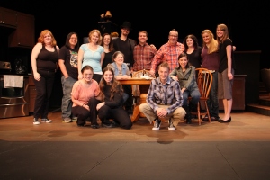
On October 6th I was able to attend a Cardinal Stritch theater production of the show ‘Rabbit Hole’.   I had been working on the set as part of the crew building and painting the set for weeks before the show opened, so I was excited to see my work on the stage again.  I was looking forward to how each section of cabinetry would be used and how the floors and different parts of the set would look under the professional technical lighting.  How the actors looked on the set was also something I was looking forward to.  I also knew that the show was supposed to be sad; about a couple who lost their son in a car accident, meeting the young man who was driving the car, and dealing with the grief of the whole situation.
It was great to watch our minimal set come to life on the stage.  The simple color scheme made more sense because the actors brought so much color to their characters.  This show was highly emotional due to its content, so the large black areas on the set played up the grief and helplessness that they were feeling.  The set was made up of three different rooms and demonstrated the idea of actual ‘rabbit holes’ existing in real life.  I also liked how the dialogue the actors were saying also played up this idea as well.
I got to see all of the different details that I would have normally missed just viewing it as a spectator.  The fact that the counter tops were painted to look like marble, the candles on the cake were actually lit, the food the actors ate was real.  I do believe though that it does change how you see a show if you work on the set and know what things are made of.  I knew that the couch was hard as a rock; I knew that the cabinet drawers stuck shut due to the paint; I knew that the crème caramel didn't turn out like it was supposed to.  Knowing some of the secrets of the craft in a way brings you into the theater world, but also pulls you out of the show itself, makes it harder to be sucked into the shows time and place and feeling.
There are still three shows left in the Nancy Kendall Theater at Cardinal Stritch's Milwaukee Campus!  If you can I highly recommend this show.  Tickets are on sale now: $12 adults, $10 seniors and $6 students (Stritch students get in free).

Spell Block Tango

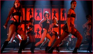
I came across this video while searching for creative inspiration for a project.  I have seen the movie version of the 'Cell Block Tango' from the musical Chicago.
chicago_cell_block_tango1
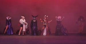
This was a spoof of the same song but done very creatively using the very well-known villains from the Disney franchise.  Although not child friendly as most Disney related things are, it is still defiantly not as 'rated-R' as the original that it was based off of.
enhanced-buzz-22188-1383078911-2
The chosen villains include Cruella DeVil from 101 Dalmatians, The Evil Queen from Snow White, Ursula from The Little Mermaid, The Queen of Hearts from Alice in Wonderland, Scar from The Lion King and Maleficent from Sleeping Beauty.  The lyrics of the original song were altered to fit perfectly with each villain.  In comparing the two videos, the melodies and basic concept of each one matched very well.  The creative differences and the extent of the attention to detail on the spoof are done very well.  The facts from each movie are written into the persona and histories of each 'murderer' except for the fact that the murders of the characters are all falsified.  The set design matches the basic set of the Chicago musical; with the lighting, props and the smoke/fog.  The make-up element of the video is also well done.  I don't see it as overdone, just enough to add character and make it obvious as to which villain is which. Overall, the creative, production, written, make-up and acting elements were all very thought out.
CELL BLOCK TANGO:

Needing to See

I have recently been made very aware of the need for both eyes to be a photographer.  I have thought of what would happen if I were to go blind, what would I do with my life?  What could my photography degree and the 4.5 years of schooling I had to achieve that degree amount to?  I always figured that as long as I could get corrective lenses or at least be able to see out of one eye.  For the past two days I have been under quarantine due to the contraction of the virus that causes 'Pink eye'.  I am not sure how I came in contact with this virus, but I have noticed that my vision is blurred in one eye due to the medicine that I am taking.
I have been using my 'time off' to work on and finish up some editing that I needed to do.  This blurry vision, though only in one eye, does effect how I see.  I realized that I started double checking my work; editing one thing then closing one eye and checking to see if it actually looks like I intended it to and getting the opinion of others to make sure as well.  I think this would be a good addition to my creative and design processes, making sure that my work is satisfactory to people who haven't been staring at the project for an extended period of time.  Fresh eyes and a new perspective are always an asset to achieving perfection.

Intimate Strangers

photos
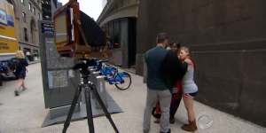
New York photographer, Richard Renaldi, has an interesting take on intimate portraits.  His concept is that complete strangers can show affection for each other for a brief moment in time, his project is to capture that moment.  Renaldi works on the streets of NYC and pulls strangers at random.  He poses these strangers in intimate positions and settings and simply tells them to show a small amount of affection towards the complete stranger just long enough for him to capture it on film.  In my opinion, it is not the photographer that makes these photos a success, he is just the puppeteer.  It is the subjects of the photos that make them successful; their facial expressions and body language are what communicates the sense of comfort and familiarity to each other.  Simply looking at the photos and not knowing the background information about how and why they were taken would lead a viewer to believe that the subjects actually knew and cared for each other.  My favorite line in the video below is: '...we are probably missing so much about the people all around us...' - it really puts reality, about our observances of people and them as actual people like you and me, into perspective.

Photographer Puts Two Strangers Together For Intimate Photographs, And The Results Are Surprising

Tuesday, October 29, 2013

Little Home in the Forest

My secret house! Not really, I found this in the woods on an adventure and decided to stick my word on it. It’s pretty secretive how the this “house” was even formed. It had a lot of spider webs and… I didn’t want to go crawling in to find out what else was in there. 

Secret Cemetery

This photograph was a lot of fun to play with. I wish I had gotten rid of most of the white boarder around the cut out letters, but nevertheless, this photo was fun to play with in photoshop. I played a lot with the contrast and brightener. I also played with the blur tool and the sharpening as well on the black, iron fencing.

Mock Up

This is an example of what my website is going to look like for our Digital Applications class. I made the header in photoshop. Currently, it has nothing on it because it isn't finished just yet. But the layout of the site is going to be clean, and concise. I want it to have a professional feeling to it because it is a business type of website.

Magazine Spread Photo

On Monday during class, our professor had students give advice on what direction we should take to start with on our magazine spread. I'm glad to have other students in my class who are so willing to help and shed some light to help me out. We all decided that I should go with the picture on the right, (I cropped it out from the photo on the left.) It is a very strong photograph and just screams editorial. Thanks guys!

HTML Photo Galleries

In building my photographic portfolio website I have found it very difficult to find a way to easily implement a photo gallery in my pages. When researching how to do this, whether it be by tutorials or codes, I found it almost impossible to find free coding for decent photo galleries. It wasn't until my instructor demonstrated how to code for a nice photo gallery that I was successfully able to. 

Now that I have accomplished this important task in creating my website, I can say that I am nearly done creating my site which I find relieving and proud of. 

Monday, October 28, 2013

Life's A Drag


A photographer from New York by the name of  Leland Bobbé composed this photograph and other similar photos. In this series he sought out for drag queens and asked to photograph them in half male and half drag. It shows off art of drag in a different way and kind of let others see a part of their lives that others may not accept but is beauty but in a different way. What do you think

Sunday, October 27, 2013

Type and Image Arrangement Assigment (1)


I love studying black history so my image is from the Harlem Renaissance. This image is called Drawing in two colors by Winold Reiss. At first glance, it makes me think of that time when art and music was an essential part of their cultural. Many artists emerged from that time period. So I think image depicts how life was for African Americans back then, as they would go out to clubs, dancing, sing, play music as a way to enjoy life in their own way. I choose the letter "R" to mean rhythm.
Here's what I have so far: 


Thursday, October 24, 2013

Photographing Under Low, Artificial Light

Wednesday I was assigned to photograph the Stritch sports teams and had some hardships while photographing the Men's Soccer game. Since it started after 6:00 p.m., the game was played under the large lights which I found difficult to shoot under. Even with shooting in sports mode with a fast shutter speed, many of my images were blurry and, therefore, didn't turn out well. I found that I need to speak with someone who knows more about shooting under this dark lighting and acquire a lens that works the best under that lighting condition. 
I have also come to general conclusion that I enjoy shooting under brighter, natural lighting conditions versus artificial lights at night. It makes for warmer, well-lit photographs that can be taken with a more general lens versus a lens that is more specific to sports photography. 

Monday, October 21, 2013

ART 239 - TYPE AND IMAGE ARRANGEMENT


Today, we had to meet in small groups for a critique on our progress with ART 239 project 4.
Somehow, only (1) member of my group showed up, which made the class period a bit weird, but also made the critique simple and concise.

For my project, I will be using the invention of Insulin as a theme. My image choice is of a little child getting a shot at a doctor's office, and my letter is an (I). The feedback I received was positive, and I got "praise" for selecting a font type that looked remotely like the syringe used to administer insulin.


I initially had trouble getting my images onto a 2-page spread, but thanks to fellow student, Cassie, I was able to manipulate the desired look.
She also gave me a bit of valuable feedback (although she wasn't in my group).

Here is the 1st draft of my project:


ART 202 Website Progression


Here are a few snap-shots of the "draft" of my site:


The story progression page


The character bios page


The HOME page


The overall layout was praised, but most of the suggestions from the "critique session" participants were for me to see how I could change the look of the choice buttons. As of today, I have changed them from the wooden look to simply black empty boxes and white text with golden symbols to underline it.


Thursday, October 17, 2013

Website Mock-Up Pages

This is/was for my digital applications classes:

So I completely change my original  idea(s) for what I wanted my portfolio website to look like and while it's very simple, I think it works for a start. I'm sure that in the future I'll change it again. My previous ideas I scrapped because I made each page on a whim, honestly. I just didn't put a lot of thought into each one.  My group feedback was little, so what was said is just to make sure I fully execute my ideas and change up the design and layout. I really didn't have anything that stood out and the design was very generic and uninspiring. Then after we view some of the mock websites, I decided to start over. I know I could do better and I feel better with what I came up with this time than in the beginning. While I know there's room for improvement, I know these pages represent what I'm aiming more effectively.
Anyway here's what I have so far:
About Page
 
 Gallery Page
Basically each page in the design aspect will look the same. All the navigation remains on each page, but when the user click on each button, the text enlarges and gets bolder. Then the page will pop up or maybe fade in with the text/images/links relate to the purpose of that page. 


Tuesday, October 15, 2013

Project 3

This is one of the finals I used for my project 3, using a given word in a picture scene that represents the word. As you can see, my word is secret. I think this is more like a "down the rabbit hole" type of picture. I wanted to use the idea of secrets in nature, and I think this one fits the bill.

QuicKit

http://www.quackit.com

Just wanted to share this cool website I found. I just used their tutorial on how to make a scroll text box for the website that I'm making for class, (Digital Applications). The different tutorials are pretty neat and self explanatory. The codes are legit and actually work. Also, it provides you with a color chart. Take a look, it might help any students with questions regarding how to input a code into their site.

Monday, October 14, 2013

HTML Coding Help


If anyone is like me, they find it hard to code html, even if they're using Dreamweaver.
Today I discovered "html dog", a website to help with html coding. It gives helpful tips, easy ways to code for certain attributes, and provides references and tutorials to enforce ways to more easily code.
I found this site helpful when trying to incorporate photographs on my website and will continue to use it when I come across future HTML problems/questions.


http://www.htmldog.com

Final Piece for Typography in the Environment

Here are some of my images for a latest project. I generally received good criticusm, I just need to go into Photoshop and play with the contrast sightly more, but the finally piece I choose to present turned out pretty well.

Just a recap...I place the letters/word on my windshield, parked, and took pictures from inside the car. I tried shots from different angles, drove around the park so the scenes would different in each picture.

Final image: 

Different angle:
 

 With someone else driving:
 
Different area and angle:
 Another image of the parkway:

Friday, October 11, 2013

TYPOGRAPHY IN THE ENVIRONMENT


For the project, TYPOGRAPHY in the ENVIRONMENT, I was given the word: GIFT.

I have already displayed the early concept images in one of my previous posts, but here are a few images of what my final result looked like:


The final piece turned out a lot better than I expected it to...


The concept is simple but visually pleasing. 


Wednesday, October 9, 2013

Beats and Brushworks with Shelby Keefe at Utrecht

If you're looking for something to do this weekend, come to Utrecht and check out this artist.
Here's there posting about the event:
"JOIN US FOR AN IN-STORE PERFORMANCE WITH NATIONALLY RECOGNIZED PLEIN AIR PAINTER SHELBY KEEFE! SHELBY WILL CREATE AN ORIGINAL, LARGE-SCALE PAINTING IN 20 MINUTES TO THE ACCOMPANIMENT OF MUSIC. SHE WILL THEN DISCUSS HER METHODS, TECHNIQUES AND INSPIRATIONS. TO LEARN MORE ABOUT SHELBY’S AWARD WINNING URBAN LANDSCAPE ARTWORK, VISIT WWW. STUDIOSHELBY.COM"

ART 202 WEBSITE REACTION


On Wednesday, the 9th of October, we spent a chunk of time going over each other's website concepts in a small group setting. 

My site idea, which is a choose-your-own-story site, initially got a bit of a shock reaction based on the fact that the layout was a bit large. 

It was so large in fact that the image layout of it that I designed in GLIFFY could not fit in the default image window. 

Most of my small group expressed surprise at the thought of me trying to "bite off so much", but nonetheless offered a bit of helpful insight. 

One such member suggested I try to include a method that would keep track of where a user was in the story before they closed out of the sight; they wanted me to utilize something like the scene selection feature commonly found on DVDs.

I might try this, but I also thought of a "timeline bar" that would show how close the user was to completing the story...something like this:


Draft of Typography in the Real World


For the project, TYPOGRAPHY in the Environment, the concept of my photo is going to be a rather straightforward shot of a gift box wrapped in white wrapping paper, the word GIFT on the side of the box, with the only color besides the black and white gift being the bow on top of the box: this will red.

Below are the first (2) shots of my project before it gets revised:


My idea for the revision of the concept, will hopefully be the same gift photographed upon a pedestal against a solid black backdrop. I will try it out and upload the images once I am finished with them...stay tuned...


Tuesday, October 8, 2013

BEAUTIFUL

I got the word "beautiful" to display in some kind of way that represents the word itself. This is word takes on so many meanings. As they say, "Beauty is in the eye of the beholder", so what I think is beautiful may not be to someone else.
I think as an artist there are a lot of beautiful things out there to me. From art itself, to people, to nature, to music, etc.
My ideas for what to do for this project varies from the simple and obvious way to portray what is beautiful to showing things we don't normally see that way at first.
I'll probably work on the concept of slowly driving in my car or just sitting in it and snapping shoots from the inside, looking through the windshield at whatever is ahead such as park landscape. Sometimes while driving it is hard to notice what we're driving by and miss out on what's around us and I think I want to try to capture the beauty of it in some way.

Well I have the rest of the week to make something happen, so let's see what I come up with.

Monday, October 7, 2013

2D-to-3D Transition


This "journey" that certain art types progress through has been known about for a long time.

Countless examples of this transition fill our entertainment world, ranging from TV and movies, to video games and even comic books. Although I was already familiar with this fact as it pertains to this comic book turned 3D movie, I was recently reminded of it when my brother found a PC game based on this comic book movie.
If I was a professional artist (my job being either a comic book illustrator or a 3D animator) I would find it either humbling or greatly satisfying to see something I created get carried over from art style to art style...


ART 202 Website Layout


Once again, I have to make a website for a college class...

This one is a bit like the one I did for ART 115, a choose-your-own-story kind of site.
This one, unlike my previous site, will not feature multiple story-lines, but one extended one.
I aim to make it a condensed and hopefully more visually pleasing site than the one before it...

Here is the "overloaded" structure for this one:


Photographing Plays in Difficult Lighting

I had my first experience photographing a play at Cardinal Stritch University Sunday, October 6th. I knew that finding the right angles for the various scene shots may be difficult, but forgot about the hardships of lighting. 
Stage lights can be hard to shoot under because of the typical high contrast they create and also the inability to use flash. Compensating for the harshness of the lighting or the lack there of in some instances was a challenge but I believe I overcame it well. By adapting my ISO, usually keeping it between 400-800, slowing my shutter speed down and adjusting my aperture accordingly, I was able to effectively capture the actors in the scenes in this difficult lighting. Though some graininess and hot areas occurred due to the means of lighting available, those are elements that I can work through to produce good images for the theatre department.
All in all, I think it was a great experience and helped me learn more ways to deal with and conquer difficult or limited lighting. 

Milwaukee Bucks Court Design


This week the Milwaukee Bucks revealed their new court design for the BMO Bradley Harris stadium. The new design is mostly green with few red accents which is easier on the eye compared to the previous red and green court. It also has a white angled design that is sleek and contemporary. I think this new design is a huge improvement from the previous design. It looks a less animated and has a sophistication that you see in other Wisconsin stadiums like award winning Miller Park. I wonder if this new court signifies the end of the possibility of a new home stadium for the bucks. Earlier this year the team was unhappy and blamed their lack of success, fan support, and recruits on the outdated stadium. 


Brazil's 2014 World Cup Logo

Excitement is building in the world of soccer as we approach the 20th World Cup tournament this Summer in Brazil. Held every four years, this international tournament is the Super Bowl of soccer. It is the largest and most important tournament of the sport. Every team is competing for their country with the prideful spirit that most sports only see in the Olympics. One of the first steps of each World Cup campaign is the release of its logo, followed by the critique of designers and fans from around the world. The logo, designed by Brazilian agency Africa, was based on an iconic photo of three champions holding the cup in the air. The shape of the logo reflects the actual World Cup trophy and the hands are said to also represent Brazil welcoming the world. Although the design has been met with some harsh criticism, I actually like the design and think the organic, yet simple shapes, mixed with layered symbolism makes this logo one, if not the best logo the World Cup has had to date. Below you can see the logo, a picture of the trophy which the design was based on, and past World Cup logos.
 http://www.logodesignlove.com/brazil-world-cup-logo-2014


lecsu.blogspot.com

Ted Talk: Alexa Maede


Alexa Maede: Your body is my canvas

Alexa Maede has done something that I've never seen before and never even thought about. She has taken 3-D people, spaces and objects and made them appear 2-D by painting and photographing them. Her process is completely unique and transformative. I think it is incredible how, not only do these 3 dimensional scenes look like paintings, but have a painterly feel as well. Maede experiments with several styles and techniques and each one seems to fool the eye and create unique beautiful pieces. After watching this video I feel completely inspired.
lecsu.blogspot.com

Northwestern Mutual Tower 2017


In 2017, Milwaukee financial powerhouse, Northwestern Mutual is changing the city's skyline in a big way. Their plans for a new tower, which will replace one of their former buildings with a failing design structure, will be "Milwaukee's first significant building of the 21st century." Not only will the building visually change a prominent part of down town, but it will also utilize the space better by being able to hold almost 2,000 more employees. Another interesting aspect about the project is that Northwestern Mutual will make ties to the community by allowing students from MSOE design the common space for the tower. Northwestern Mutual has been an essential part of Milwaukee's economy. For example, they are one of the only companies in Milwaukee who avoided laying off employees after the economic crisis of 2008. The new tower is a symbol of growth and reflects the impact Northwestern Mutual has had on our small city. Below you can see an illustration of the current building within the down town skyline and a few interior architectural drawings.


lecsu.blogspot.com

Developing A Portfolio Website


My (Simple) Workflow To Design And Develop A Portfolio Website, By Adham Dannaway


As a student pursuing a career in design, one thing I hope to develop in the near future is a portfolio website. It is important to have a portfolio website in the world of design because it gives other designers and future employers access to your work, while show casing your creative aesthetic and skills through the website itself.

My (Simple) Workflow to Design And Develop A Portfolio Website, written by Adham Dannaway was one of the most informative design articles I have read in a long time. Dannaway goes through the process of how he designed his own portfolio website, while offering tips and links to helpful online sources that aid in coding. The article walks you through both the technical side of website development and the conceptual side. Although some of the coding he spoke of is a little above my head at this point, I was incredibly inspired by this guide and will definitely refer to Dannaway's article when I am ready to develop my portfolio website. I would highly recommend this article for any young designer looking to make their own website in the future.
lecsu.blogspot.com

Sunday, October 6, 2013

Torontos New Eco-Friendly Jail

Finding eco-friendly products are easy to find now a days whether it be decorative items, bags, paper, mugs, shoes or clothes. The reason for the rise in popularity can be broken down to four reasons: A range of products to choose from. It sets a trend. It's completely safe and great prices. The art culture has widely accepted eco-friendly ideas because of the many different concepts it holds.
Online I found an amazing news article about a new Toronto jail called The Toronto South Detention Centre, with state of the art, eco-friendly features, that is set to open in the next few weeks.
The facility will hold people awaiting trail and those sentenced to provincial terms of less than two years.
What makes this architecture eco-friendly is its design. Robert Boraks, the architect who designed this jail, said that the idea was, "to introduce as much natural lighting as possible."
Dr. Sandy Simpson of the Centre for Addiction and Mental Health said that natural light is important to the mental health of inmates. The proper amount of natural light and enough darkness at night can greatly affect you physically and psychologically.
Robert Boraks believes that if these inmates get this precious amount of natural light a day then they will show statistically that their physical and psychological wellbeing will show to be better than in other jails will poorly lit facilities.
In my opinion I think it's an awesome idea to have nature interact with the inmates. Just something as simple as getting sunlight has improved my day on multiple occasions! I believe any correctional facility needs to learn a thing or two about concentrating a little more on the mental health of the inmates instead of the physical side alone.

Friday, October 4, 2013

National Cardmaking Day

If anyone is looking for something to do this weekend check this out (sorry last min):

Thursday, October 3, 2013

Site Critique


Charmone and I both had to critique a not-so-good website for our Digital Design Class.. The site is: Bad Site Yo

Here is what we had to say..
Would like to add that this website was featured in World’s Worst Websites from issue 163.
Aesthetic Properties
It is not cohesive in the least bit.
There are a bunch of icons and animations that have nothing to do with the site itself such as the chicken.
No visual organization except the tabs.
Visual themes are randomness. There are too many visual animations that have nothing to do with leasing or selling cars. The visual aspect with the girl singing on the page is very distracting, I’m not sure if she is singing about the cars or not, but her outfits are poor in choice. This site is loaded with random ads along the sides. When you click on the video at the WAY bottom of the page, you can’t hear the video because the music that is on the page cannot be paused or stopped.
There are no color schemes. There are every color you can think of on this website. There is no cohesiveness.
The “fun stuff” tab isn’t fun.
The “about Ling” tab tells about her, however it’s still random, with her talking about visiting china. Why do we need to know this about her?
There is a bit too much told about her that is repetitive.
Structural Properties
There are TOO many things to click on. It’s got tabs to navigate, which is the only good thing about this website.
You know where you are on the website when you click each tab, but the images and visual elements don’t necessarily tell you, you are there because of all the random elements on each page.
Can click the tabs and things on the side bar to go to different places, however, you are just totally overwhelmed by all the clickable links around on this website, it is easy to get confused.
There are slow loading pages.
unPresented media is present.
Conceptual Properties
He does present pictures of cars, however, it gets lost in everything else that is random on this website.
He is trying to make his website attractive, it looks like he through too many elements at once to make it look attractive to users.
No, because its utterly confusing.
It is not an improvement.
Audience
It’s supposed to be for an audience that wants to buy and rent a car.
It is not appropriate for this said audience, because an 8 year old would have a lot of fun on it.
The “about Ling” tab tells about her, however it’s still random, with her talking about visiting china. Why do we need to know this about her?
There is a bit too much told about her that is repetitive.
Also, her wording is very odd sometimes. She tells her customers how she is hotheaded and gets mad very easily and shouts. This doesn’t make me want to buy a vehicle from her.
Sugar Skull Tattoo


Lately, I been into the whole Dia de los Muertos sugar skull look and how beautiful a skull can look... Today, I started looking around at different tattoo designs, because lets face it, tattooing is an art form. The way they work a needle and use the body as a canvas can either be disastrous or utterly amazing. When it is amazing though, you yourself become a walking, talking, piece of art work, and I love the idea of that. I know that I would never regret the choice I made on my first tattoo. It's always important to find a design you want that you will always love throughout life. 

Typography 239

Typography 239 has made me double look and dig deeper at the logos and store titles that before I would overlook and wouldn't bother taking a second glance. Today at Bayshore Mall in Glendale, WI, I took a little tour around the mall to see what stores really caught my eye.

Here's my top three store titles that really caught my eye and the reasons why!

1. Journeys- The logo is written in a graffiti style to appeal to younger shoppers. The 'O' in the name is drawn to look like a compass pointing with arrows going North, South, West, and East to convey a feeling of moving which is really creative since the store main items are shoes.


2. Zales- The Jewelry store is a very recognizable store chain because of its simple and classy color palette of black and white. It's font is all bold caps but also simple, with the exception of a small embellish on the 'A'. This upside triangle symbolizes strength while also referring to Zales' main product: diamond jewelry.  


3. Frooties- This colorful and playful display of typography is clearly expressing what the store is all about! The two 'O's' in the title is an orange and a strawberry which gives the impression of smoothies being made straight from the fruit without any added preservatives. The lining around the title with the bubble like circles behind gives it a happy and uplifting feel.